Today’s policy-makers and analysts can rely on increasing amounts of available data (open data, big data, etc.) for evidence-based policy formulation and evaluation. With the improved data availability, the complexity of data analyses also increases. While this seems to be mainly the analysts’ concern, users of the results (ministries, agencies, researchers, etc.) are also affected. As more data becomes available, the task of integrating it and drawing meaningful conclusions becomes more challenging. It is the analysts’ task to facilitate the interpretation and full exploitation of results.
Delivering on this challenge, ZSI is developing customized approaches to facilitate data and results interpretation. We combine our strong track record in qualitative methods and stakeholder inclusion processes with cutting edge interactive data visualisations. The visualisations allow users to explore complex sets of data following their own priorities. Through this, we make data available at the depth a specific user requires, and allow them to draw own additional conclusions, extract context information, etc. As such, the visualisations are a tool to combine the analysts’ insights with the users’ interpretive abilities and context knowledge. In addition, they provide exciting ways of presenting results to a variety of publics – while our visualisations always serve a purpose, they are also allowed to look good.
We offer
- Standard and customized, javascript-based interactive data visualisations for web publishing and user-centered visual analytics
- User-centred data exploration tools
- Dynamic and interactive versions of basic chart types (bar chart, line chart, pie chart, etc.)
- Web-based presentation techniques including interactive charts
- Connection of an R-based data backend with a javascript-based interactive visualisation frontend (for in-house analyses or public dissemination)
Example visualisations
Up-to-date examples can be found on our visualisation.zsi.at blog.
Other examples include
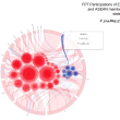
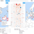
- Undirected geomapped networks over time (Social network analysis of international co-authorship relations; works best in Chrome and Firefox browsers)
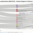
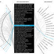
- Hierarchical data (Co-authored publications in specific fields of science)
- Tree maps (used for the conceptualisation of impact monitoring frameworks)
- Javascript-based presentations, running in any modern browser and including interactive charts (example from the SEA-EU-NET project)
References/ Contracting Authorities:
- Bundesministerium für Wissenschaft, Forschung und Wirtschaft
- European Commission (Framework Programme 7 and Horizon 2020)
Ansprechperson: DI Dietmar Lampert
Relevante Artikel:
Kooperationspartner
Projekte
- Data Monetization, Interoperability, Trading & Exchange
- Austrian Research and Technology Reports 2023-2026
- Kooperationen in Lehre und Forschung zwischen Österreich und Nordamerika
- Bestandsaufnahme der Kooperation und Vernetzung österreichischer und nordamerikanischer Forschender, FTI-Stakeholder und -Institutionen
- Platform for a policy evaluation community for improved EU policies and better acknowledgment
- show more ..
Publikationen
- Wie kooperiert Österreich mit Nordamerika im Wissenschaftsbereich?
- Österreichischer Forschungs- und Technologiebericht 2021
- Austrian Research and Technology Report 2020
- Österreichischer Forschungs- und Technologiebericht 2020
- Kopublikationsanalyse Österreich-China 2013-2018 - Endbericht
- show more ..
Veranstaltungen
- Webinar: Daten finden, nutzen und neues Wissen schaffen
- GSK-Forschungsinfrastrukturen in Österreich
- KNOWMAK – Launch event at STI 2018 conference in Leiden


